I’ve been experimenting with using artificial intelligence apps to help me format documents. Look, |I will freely admit it: my artistic design skills are notable for their absence. (I wrote about this in I miss the old website!.
So when I decided that I would like to create a flyer for my forthcoming creative writing courses, and that I would like it to have the look of a zine, it made sense to me to enlist the services of artificial intelligence.. In case you are not familiar with zines, they were publications created by fans of one thing or another — hence “fanzines” or fan magazines. Back in the eighties they were, to an extent, the social media of their day. They had a hand-crafted look and feel, probably because they were largely hand-crafted. Here is a photo I took of a collage of football zines on display at the British Library:
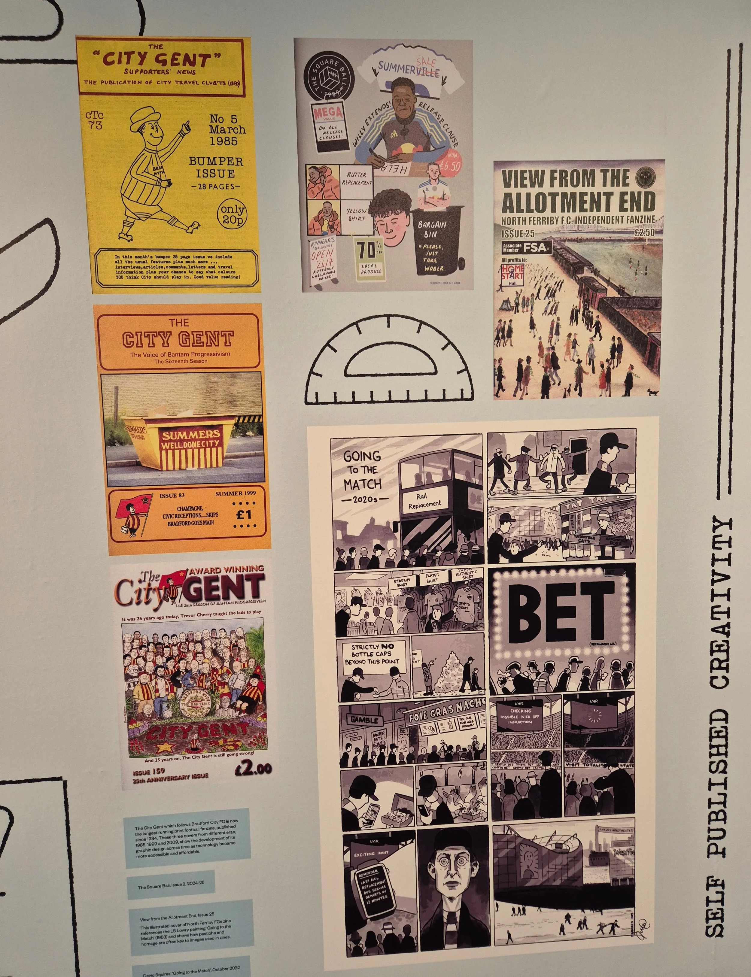
zines, by Terry Freedman
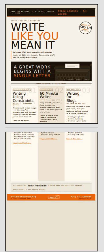
So what I did was, I uploaded three flyers about the next three courses I’m running, and instructed Claude to create a flyer out of them with a zine vibe to them.
It very quickly produced a nearly-decent flyer in both HTML and pdf formats. This is what it looked like:
Claude flyer #1, by Terry Freedman
OK, not a bad colour scheme, but not the down and dirty look I wanted either. Also, the course descriptions have a page break in the middle, and there is a lot of white space.
I instructed Claude to give the thing a monochrome look, and it came up with this:
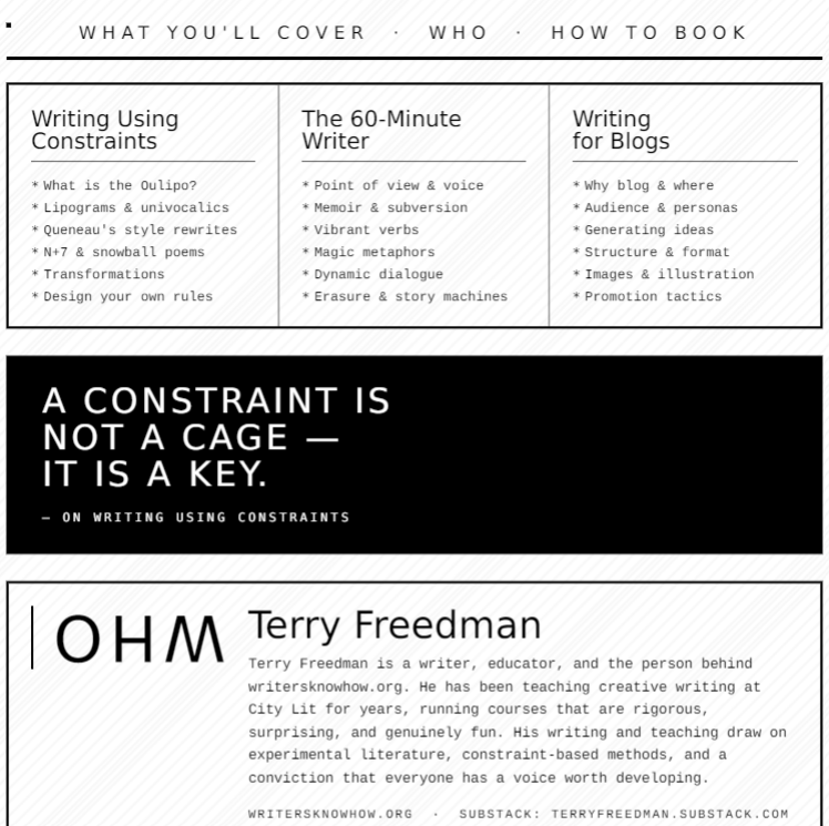
Claude flyer #2 by Terry Freedman
OK, so this is much better, but there is a glaring error, as you can see: the word “WHO” is upside-down.
Claude tried to get around this by including an illustration, but for some reason nothing it tried would show up. The next iteration, in a Word version, looked like this:
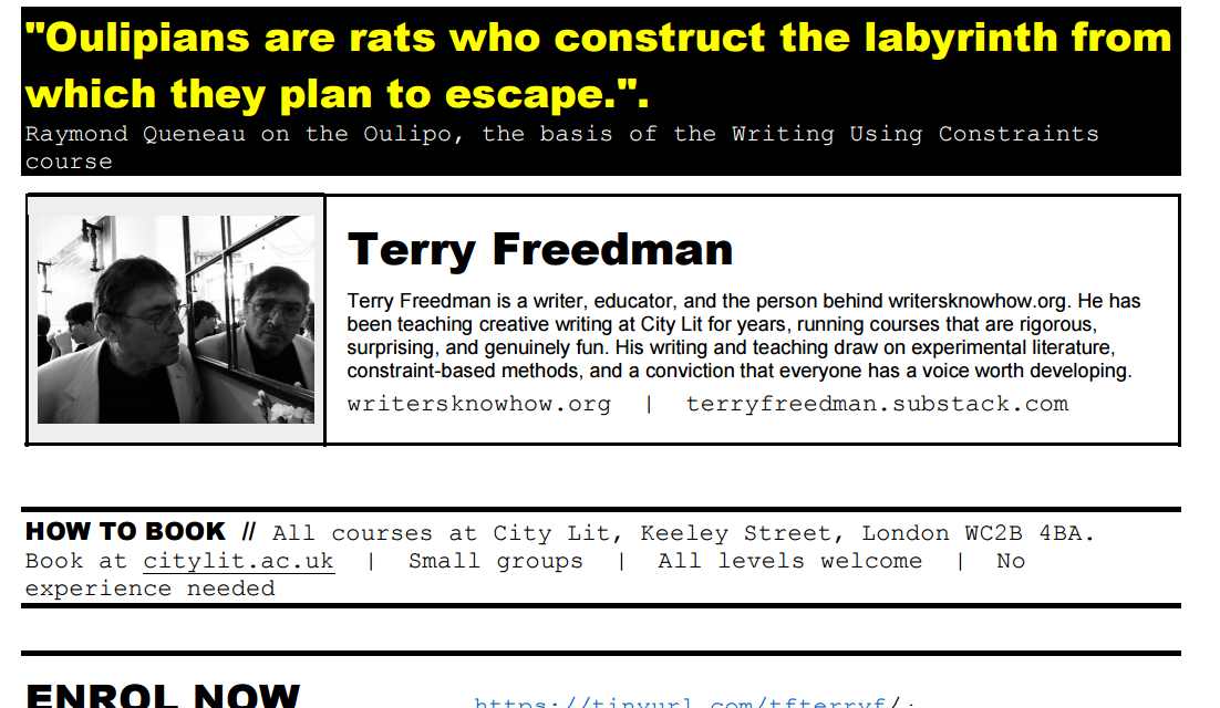
Claude flyer #3 by Terry Freedman
By this time I had played a more active role, by doing the following:
Increased the size of the font in the small print section. In one of them it was a size 9 and in the other it was a size 7. These are ridiculous sizes, especially considering that the font, Couirier New, is monotype. That means that the space taken up by each letter is the same as that taken up by every other letter, which makes it harder to read.
Added some colour.
Added a photograph of myself.
Created shorthand URLs and tur5ned them into live links.
Changed the quotation.
Changed some of the text. One of the course descripters read “No lectures. No waiting. Write from the first minute.” I changed that because I am going to be introducing each technique and activity with a short talk of perhaps five minutes. So that could be construed as a lecture by some people! Also, there is no way that people can start writing from the very first minute — unless I were to cheat by asking them to write down their names! So those bits were changed to: “No long lectures. No waiting. Just words on the page from the very first lesson”.
The next iteration looked like this:
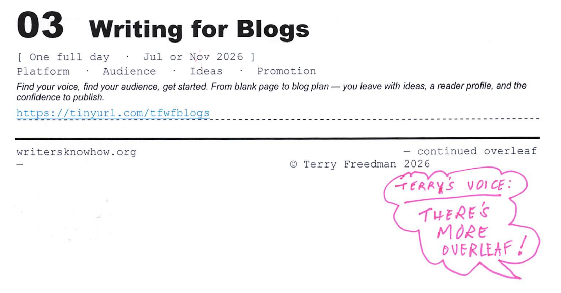
Claude flyer #4 by Terry Freedman
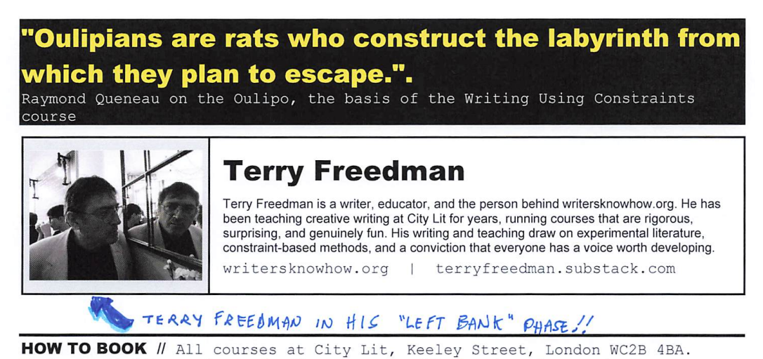
Claude flyer #4b by Terry Freedman
As you can see, I’ve added a few comic book-type touches, such as speech balloons. I’m not convinced that this enhances the flyer from a professional look point of view, but it does give it more of a handmade feel I think.
There are several interesting things to come from this exercise I think:
Firstly, the designs Claude came up with were much better than anything I would have thought of. As I say, I’m a wordsmith, I’m no graphic designer.
Secondly, it wouldn’t have occurred to me to include a quotation. I loved the idea. In the end, I didn’t use the one that Claude had provided, but the principle is sound, obviously.
Thirdly, Claude came up with a few interesting ideas unprompted. For instance, it did a pretty good job on my bio, and it came up with succinct — and still accurate — descriptions of what the courses cover.
Fourthly, this siort of thing works much better if you treat Claude (or whichever AI app you choose to use) as a partner rather than a boss.
If you would like to see what the final iteration looks like in its entirety, click the button below in orde to download the PDF.